
//Note To Self: Re-take pictures.
A month and a bit ago, I managed to jump in on a session planned for the first years. We had a visiting workshop with Reading graduate Sally Castle.
(click here for her website)
Session One:
I really really enjoyed being able to practice and experiment with type for a solid day. Sally was really flexible with how long we could spend on each of the three possible activities or could whether we wanted to do all three at all!
I began with the morphing activity. We were set to morph one letter (I chose 'p') from one typeface to another (I chose the infamous Gill Sans Italic morphed to Rockwell). Although we were designated to do about ten frames I went a bit off the rails with excitement and ended up making a twenty-plus frame rough. When I have enough time I will hopefully vectorise and load this into flash so that it can be viewed.

I then moved onto taking my intials and within the same typeface making it morph into the other. I chose Fette Fraktur because of the solid shapes. It actually took me about five minutes and was mainly because I was copying from an 8pt example in a text book.
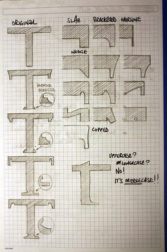
I then jumped exercise three (turning a sans serif into a serif font) by sketching out what makes a serif and different kinds of experimental serifs to use.
We were set the task of figuring out before the next workshop what kind of typeface we'd like to make. I already had in mind some form a typeface with modern ligatures e.g. for www and txt. I also wanted to make a pixel-based typeface because of my enjoyment at using 'Unibody 8' by Underware within my website and the tiny tiny difference the placement of one pixel can make to a letter. I thought it would be a good challenge as you have to reduce letters down to their bare minimum and see just how you display a certain character
Session Two:
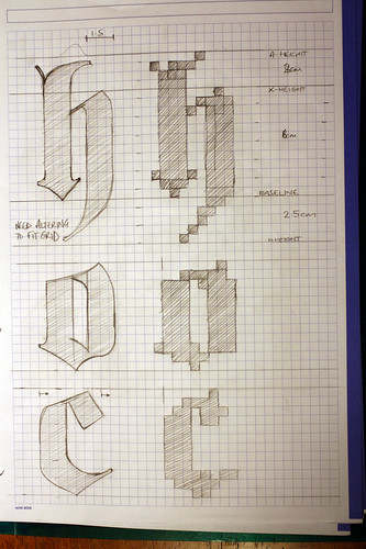
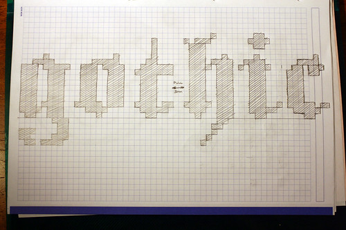
I missed the first half of the session because of other commitments but got as quickly into developing my idea as quickly as I could. I had thought over the week to turn the Fette Fraktur into a pixel-based typeface because it would make an amazing display for web headings on my site (overtaking the top nav-links section that I've always been a bit unsure on). I mades skethces from a specimin which unfortunately display the Fraktur at something like 8pt and then tried to turn them as best I could into pixel-based versions. I didn't go too far because I knew I'd have to rework them afterwards witha more accurate version of the typeface.

Session Three:
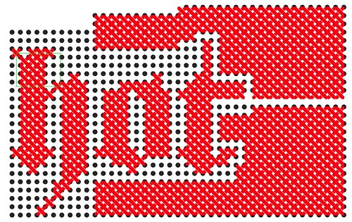
Unknowingly after the afternoon devloping a rough and talking to Sally C in session two, I embedded this more throughly in my FMP and have since planned it so that they will work alongside. The pixel typeface is now going to be tuned into cross-stitch to reflect the personality and traits of one of my characters called 'Nora'. That's for an FMP post anyway.
Sally showed up the some of her work in FontLab and the basics of the program but when we jumped on the computers afterwards none of the software was working so we had to work in illustrator. Although still a viable method, it wasn't what Sally C had planned so the day took an altered form. I managed to get my cross-stitch finalised though after many trials (better research would have prevented this!) and have made a rough you can see here:
Look forward to the next session!
No comments:
Post a Comment